The definition of sounds: exploring Spotify Audio Features
Patch Notes 0.1.1
These days, it’s harder than ever to define music by genre alone. Even with more subgenre labels than ever before, they often fall short of fully capturing what a track really sounds like.
This is a familiar challenge in the DJ world, too. You might know the kind of sound or vibe you're going for, but genre tags can be misleading. Sometimes, two songs are labeled the same genre but sound completely different. Navigating this ambiguity to find the right track is part of the craft.
But what if we could reverse the process? What if music could come to us, based on characteristics we actually care about? That’s the power of Spotify’s audio features: numeric representations of how a track sounds and feels. These features fuel Spotify’s recommendations, and help us quantify music beyond genre.
🎧 "When genre fails, data speaks."
What Are Spotify Audio Features?
Spotify uses AI models to analyze audio and assign scores to various features, each ranging from 0 to 1:
- Valence – Measures musical positivity. Higher = happier.
- Danceability – How suitable a track is for dancing.
- Energy – Measures intensity and activity. Higher = faster, louder, more aggressive.
- Instrumentalness – Indicates likelihood a track is instrumental. Higher = fewer vocals.
- Speechiness – Detects spoken word. Higher values often mean podcasts or spoken tracks.
- Mode – Whether a track is in a Major (1) or Minor (0) key.
Curious to understand what these numbers actually sound like, I explored them myself.
The Dataset
For this project, I used a public dataset from Kaggle:
Spotify Dataset 1921–2020 (600k+ Tracks)
The dataset includes 600,000+ tracks released between 1921 and 2020. Each track includes metadata like artist, genre, tempo, and various audio features.
I cleaned and merged the data using R, using tidyverse and stringr to extract primary genres and artist IDs, convert durations, and label major/minor modes.
💡 Technical details were kept in collapsible code chunks to keep the article focused on insights.
CODE: Data Cleaning
Load Data
# load library
library(tidyverse)

# load csv
tracks <- read_csv("./data/tracks.csv")
artists <- read_csv("./data/artists.csv")
Convert release date to year
# convert release date to year
tracks <- tracks %>%
  mutate(release_year = as.integer(substr(release_date, 1, 4))) %>%
  filter(!is.na(release_year))
Convert ms to minute
# convert ms to minute
tracks <- tracks %>%
  mutate(duration_min = as.numeric(duration_ms / 60000))
Cleaning Artists ID
# cleaning artist ID
tracks <- tracks %>%
  mutate(artist_id = str_extract(id_artists,"(?<=\\[')[^']+"))
Join Table
# join data
selected_artists <- select(artists, id, followers, genres)
merged_df <- left_join(tracks, selected_artists, by = c("artist_id" = "id"))
Clean Genres
# cleaning genres
merged_df <- merged_df %>%
  filter(!is.na(valence), genres != "[]") %>%
  mutate(
    primary_genre = str_extract(genres, "(?<=\\[')[^']+")
  )
Labeling Mode
# convert mode label
merged_df <- merged_df %>%
  mutate(
    !is.na(mode),
    mode_label = if_else(mode == 1, "Major", "Minor")
  )
What Does Danceability Sound Like?
To explore danceability, I sorted tracks by highest values and listened to the top 3. Surprisingly, they came from completely different genres:
- Malina Olinescu – Puisorul Cafeniu (Romanian children’s music)
- Tone-Loc – Funky Cold Medina (Hip hop classic)
- Nu feat. Jo.Ke – Who Loves the Sun (Edit) (Deep house)
Despite genre differences, all three tracks are rhythmically compelling and easy to move to. This suggests that Spotify’s danceability score prioritizes groove and rhyRhmic accessibility over genre.
CODE: TOP 20 Danceability
# top dance track
top_dance <- merged_df %>%
  select(name, artists, genres, danceability, popularity) %>%
  arrange(desc(danceability)) %>%
  head(20)
🕺 "Danceability isn’t about genre—it’s about feel."
Energy – Not What I Expected
Initially, I assumed high-energy tracks would be aggressive electronic or metal songs. But some of the highest energy tracks came from vintage jazz recordings and live performance applause:
- Maurice Chevalier – Moi J'fais Mes Coups En Dessous
- Condos Brothers, Ben Bernie & His Orchestra – I'm Bubbling Over (Reprise)
- Benny Goodman – Applause / Transition Back to Finale (Live)
All scored energy = 1.0. These were surprising results until I realized that noise, crowd sounds, and production artifacts likely influenced the energy score.
Modern examples like Slipknot – Eyeless (energy = 0.997) and Sonic Youth – Hey Joni (energy = 0.990) confirmed that distorted guitars and harsh textures also contribute heavily to this score.
CODE: TOP 20 Energy
# the highest energy tracks
top_energy <- merged_df %>%
  select(name, artists, genres, energy, popularity) %>%
  arrange(desc(energy)) %>%
  head(20)
⚡ "Energy can be volume, distortion—or applause."
Valence – Musical Sunshine
The highest valence scores came from playful, melodic tracks with bright tones and often featured brass instruments:
- Raymond Scott – Chatter
- Raffi – Les Petites Marionettes
- Montez de Durango – Pasito Duranguense
They all scored a perfect 1.0 in valence, suggesting that clear melodic structure and cheerful timbres drive this metric.
CODE: TOP 20 Valence
# high valence
high_valence <- merged_df %>%
  select(name, artists, valence) %>%
  arrange(desc(valence)) %>%
  head(20)
☀️ "High valence = sunshine in audio form."
A Secret Relationships Between Features
After Exploring the features, we are not only getting to know how each feature sounds like but also able to find a relationship between features and other meta data that goes beyond the expectation.
Tempo Has Risen Over Time
CODE: Chart
# Average tempo by year
tracks %>%
filter(release_year > 1921) %>%
group_by(release_year) %>%
summarise(avg_tempo = mean(tempo, na.rm = TRUE)) %>%
ggplot(aes(x = release_year, y = avg_tempo)) +
geom_line() +
labs(title = "Average Tempo Over Time",
x = "release year", y = "average tempo") +
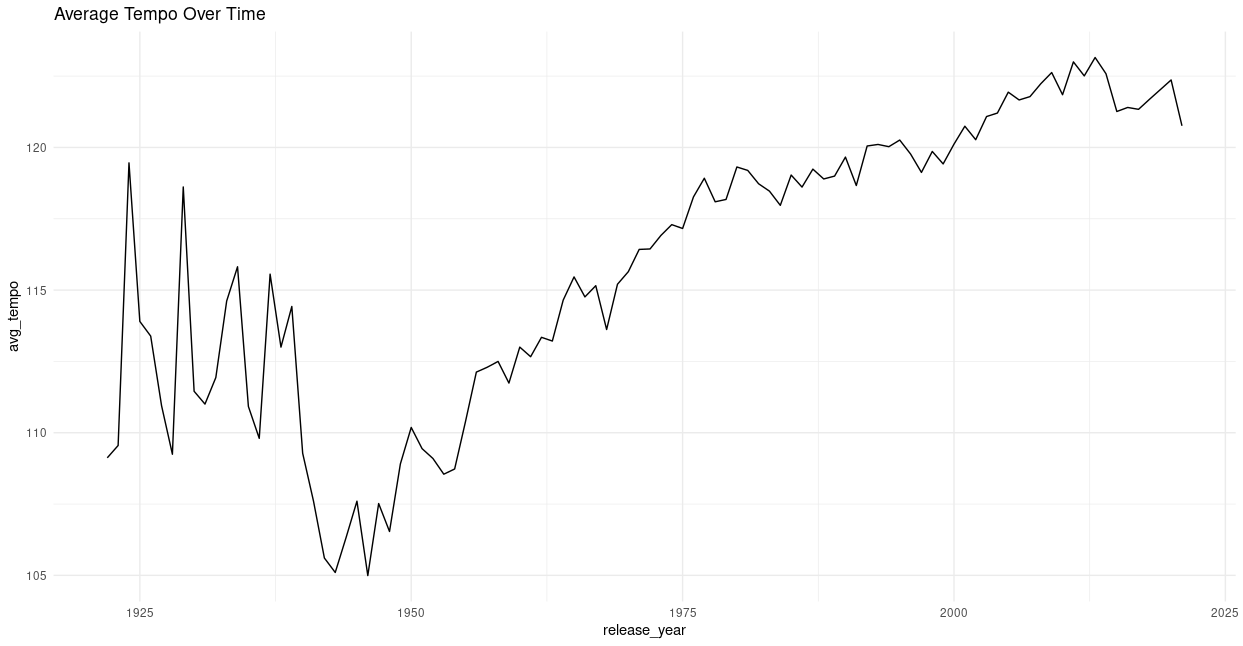
theme_minimal()Plotting the average BPM of songs by year shows that music has gotten progressively faster over the past century—until a slight dip in recent years.
This may suggest a peak in popularity for high-tempo music, possibly followed by a return to slower or more varied tempos.
Instrumental Tracks and Popularity
CODE: Chart
tracks %>%
  sample_n(300000) %>%
  filter(!is.na(instrumentalness), instrumentalness > 0.1) %>%
  ggplot(aes(x = instrumentalness, y = popularity)) +
  geom_point(alpha = 0.4, color = "#1DB954", size = 1) +
  geom_smooth(method = "loess", se = FALSE, color = "black") +  # trend line
  scale_x_continuous(labels = scales::percent_format(accuracy = 1)) +
  labs(
    title = "Does Instrumentalness Affect Popularity?",
    subtitle = "Tracks with instrumentalness > 10%",
    x = "Instrumentalness",
    y = "Popularity (0–100)",
    caption = "Sample of 300,000 tracks from Spotify dataset"
  ) +
  theme_minimal(base_size = 13)
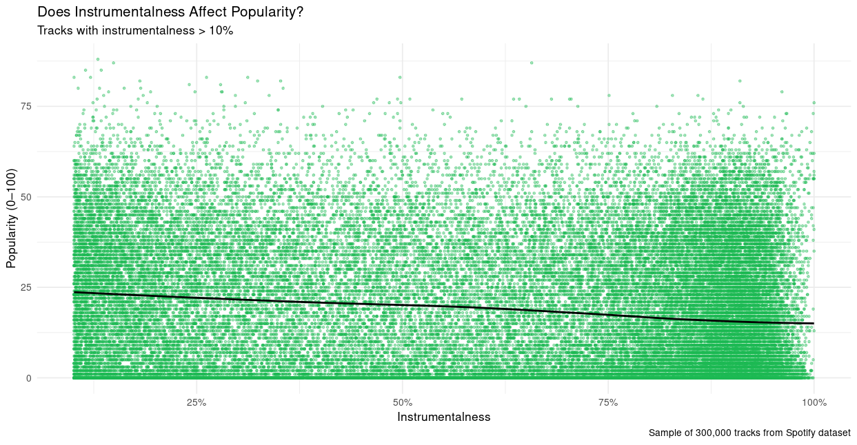
Instrumentalness and popularity have an inverse relationship. While vocal-heavy tracks dominate the charts, there are still popular instrumentals, especially in electronic or ambient genres.
🎻 "Lyrics help—but grooves still move."
Major ≠ Happy
CODE: Chart
# Mode Vs Valence
merged_df %>%
filter(!is.na(valence)) %>%
ggplot(aes(x = valence, fill = mode_label)) +
geom_density(alpha = 0.5) +
labs(title = "Distribution of Valence by Mode",
x = "Valence", y = "Density") +
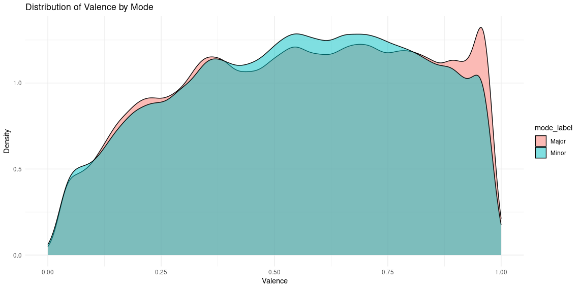
theme_minimal()A common assumption is that major key = happy. But density plots of valence by mode show that both major and minor tracks span a wide range of emotional expression. While there’s a spike of high-valence major tracks, many major songs aren’t particularly happy.
Mood Map: Valence vs Energy
CODE: Chart
# mood map (valence vs. energy)
tracks %>%
sample_n(200000) %>%
ggplot(aes(x = valence, y = energy, color = popularity)) +
geom_point(alpha = 0.7, size = 0.8) +
scale_color_viridis_c() +
labs(title = "Mood Map of Songs", x = "Happiness", y = "Energy") +
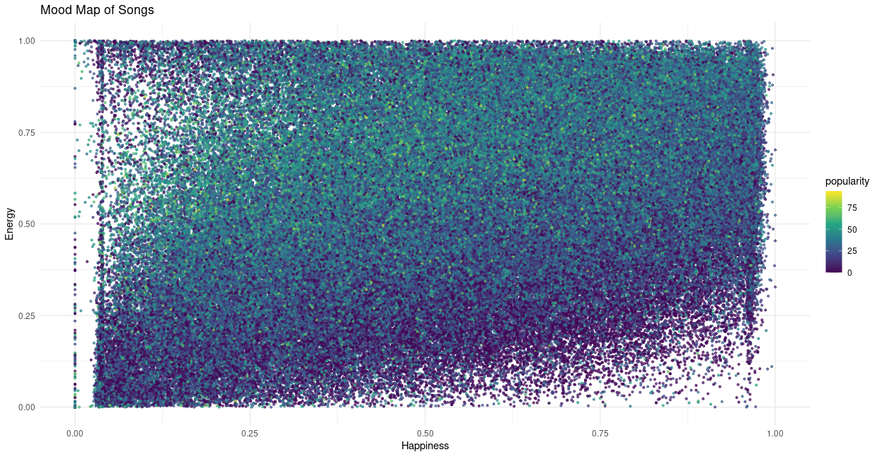
theme_minimal()When we visualize valence (happiness) and energy together—color-coded by popularity—we see that the most popular songs tend to fall in the high-energy, mid-valence region.
This suggests that tracks that are too “happy” or too “sad” might be less commercially successful, while those with emotional balance and driving beats strike a mainstream chord.
🎚️ "The sweet spot: energetic but emotionally balanced."
Final Thoughts
Exploring these audio features gave me a new appreciation for how Spotify's AI sees music, and made me question some long-held assumptions.
Listening to tracks at the extremes of each feature revealed surprising discovery. And looking at the relationships between features helped explain trends I’ve felt as a listener and DJ, but couldn’t quantify—until now.
There’s enormous potential here for artists, curators, and DJs to build better systems for organizing, selecting, and discovering music. By going beyond genre and embracing data-driven insight, we might get closer to understanding not just what music is—but what it feels like.